Methods
This page is just a guide for the interactive visualization. To learn about the methods used in the paper, to get the citation for the paper, or to contact the authors, check out the website for the project instead: https://aaronclauset.github.io/facultyhiring/. You can find shareable raw data there, too!
In general: Circos / Chord / Sankey Plots
The plot that we've made is an adaptation of code in d3.js which is in turn an interactive adaptation of Circos which is in turn a radial and bidirectional form of a Sankey diagram. If you like these plots, there are many excellent and interesting examples to explore.
This particular visualization
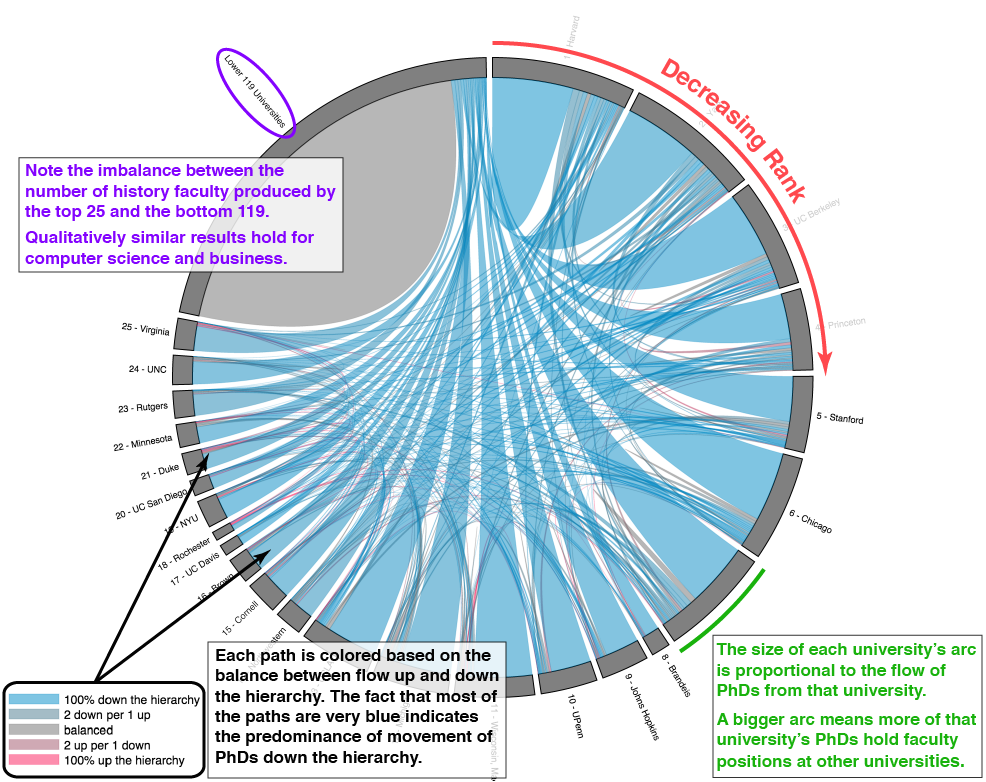
Here we arrange the universities around a circle, with the arc length of each university proportional to its production of PhDs that go on to become faculty. We place the universities in rank order, starting from 0:00 and proceeding clockwise down the ranks.
The figure below highlights some key aspects of the visualization.